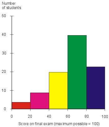
A histogram is represented by a bar graph and can
display one or more variables on a graph, these graphs are also known as
frequency distribution graphs. These types of graphs shows the distribution of continuous
data which is represented on an x and y axis, also the bars should always be
next to each other when displaying the information. In the histogram above a
single variable is represented, the scores on the final exam and the y axis
represents the number of students which ranges from 0-50 and the x axis
represents the score on final exam which ranges from 0-100. This graph also
uses different colors to represent the different scores which I found made it
easier to read.
No comments:
Post a Comment